Accessibility Role, Name & Value
Why
User interface components need a role, a name and sometimes a value, to ensure that people using assistive technologies are able to use them. Examples of assistive technologies are screen readers, switch controls and speech recognition software.
What
There are two cases where we can't use a good HTML element with built-in accessibility features, even though we want to:
- There is no native HTML element for what we are trying to achieve.
- There are technical limitations that prevents us using the semantically correct element.
In both cases, we need to build a custom control. An important accessibility principle is that a custom control needs a role, a name and sometimes a value.
How
How do we make sure that custom components have a role, a name and a value?
Role

In our last section, Button and Links, we learned that a dropdown menu button should be coded as a <button>. What if our framework does not allow us to do that? If it forces us to use an <a> instead? If the navigation component in the library we are using, is built with <a>s? Then we need to add a role.
This is done with the role="button" attribute. Now users of assistive technologies can understand what the custom control is. A <button> has the role="button" built in, so to write <button role="button"> is redundant.
Name
The custom control needs a name. In our example, the name is the content of the element, Company. As long as we have written our element like <div role="button">Company</div>, we have a good name. This is also known as the accessible name. The accessible name for our <div> is Company. Good.
That was too easy. In the following login form, we have several components – a logo, a heading, a label, a dropdown, an input and a button.

We are taking a closer look at the label, dropdown and the input. Visually there is no clear distinction between the dropdown and the input. The dropdown is coded with a <select>, which is a correct element for this case. However, it has no name:
<select name="countryCode">…</select>
It has a name attribute. This is not the same as an accessible name. This is confusing. The article What is an accessible name? explains this further. The name attribute is for computers. In a <form>, it is used as a reference when the data is submitted. This name countryCode will not help any users. It will not be picked up by assistive technologies.
To give this <select> an accessible name, we must use the attribute aria-label. Normally, we would have connected a visual label to the <select> component. In this case, there is only one visual label for both the components.
This is a <select> with an accessible name:
<select aria-label="Country calling code" name="countryCode">…</select>
Value
Some components have a value or a state. An accordion is open or closed. This information has to be accessible.
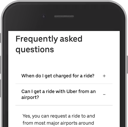
An accordion is considered a custom component. There is no standard HTML element to use here. Each accordion header should be a <button> or role="button":
<div role="button">When do I get charged for a ride?</div>
Good. It has the role of a button. It also has a name, the content of the div. To give this button a value, we need to tell assistive technologies that it is closed. This is done with aria-expanded="false":
<div role="button" aria-expanded="false">When do I get charged for a ride?</div>
Now, our accordion header has a role, name and a value.

