Accessibility Visual Focus
Why
Visual focus is crucial for all users that rely on keyboard and switch devices.
What
You learned a bit about visual focus when we talked about link states. Let us dig deeper. Visual focus is sometimes called keyboard focus or tab focus. It is a visual indicator on a interactive component that has keyboard focus. The effect is often a border or outline.
How
You will learn not to remove the focus, and two options for styling the focus.
Do not remove or hide the focus
This is the most important takeaway from this module. Whatever you do, do not remove the focus. This CSS line is ruining the accessibility for a lot of people:
outline: 0;
Another common method for hiding the focus that the parent element is to small to show it, in combination with:
overflow: hidden;
Most browsers use the outline property to show the visual focus of an interactive element. We have two options. Leave it or customize it. Removing it is not an option.
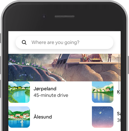
In this example from Airbnb, the destination Ålesund is the focused element. However, it is not possible to tell. The reason is that the parent <div> has overflow: hidden;
Option 1: Use the default
The easiest way to handle visual focus is to leave it for the browser to handle. This has many benefits:
- Users that rely on the visual focus, recognize it easily.
- You don't have to code anything.
- Users don't get any surprises.
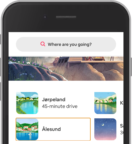
Removing the overflow: hidden; showing the default focus styling. The browser Chrome in mobile mode is using an orange outline. You might think that keyboard focus is not important on mobile devices. That is a misconception. People use keyboards and other assistive technologies on mobile devices as well.
Option 2: Customize the visual focus
We also have some challenges with the default focus.
- The default styling may not align with the color palette of the site.
- The default styling is similar to the color palette of the site.
- The default styling is not visible enough in all browsers.
The travel site Momondo has a vivid color palette. They can pick a color from their palette to use as the visual focus.
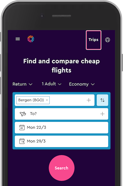
This is a modified version of the Momondo website, showing the link Trips in focus with a pink and white outline. The pink color is from their palette, the same as the search button.
As a side note, the search button has insufficient color contrast when used with white text. The contrast ratio is only 3.33. However, used as a visual focus against a dark purple background the contrast is better with a ratio of 5.47.
CSS Outline
To better make custom visual focus, you need to know about the different CSS outline properties. Head over to W3Schools to learn about the outline style, color, width and offset. Now you are better prepared to make keyboard accessible interfaces.

