W3.CSS Images
Rounded:

Circle:

Bordered:

Text:

Rounded Image

The w3-round class adds rounded corners to an image:
Circled Image

The w3-circle class shapes an image to a circle:
Bordered Image

The w3-border class adds borders around the image:
Image as a Card
Wrap any of the w3-card-* classes around the <img> element to display it as a card (add shadows):

Simon
The boss of all bosses
Image Text
Position the text in an image with the w3-display-classes:

Top Left
Top Right
Bottom Left
Bottom Right
Left
Right
Top Middle
Bottom Middle
Example
<div class="w3-display-container">
<img src="img_lights.jpg"
alt="Lights">
<div class="w3-display-topleft w3-container">Top
Left</div>
<div class="w3-display-topright w3-container">Top
Right</div>
<div class="w3-display-bottomleft w3-container">Bottom
Left</div>
<div class="w3-display-bottomright w3-container">Bottom
Right</div>
<div class="w3-display-left w3-container">Left</div>
<div class="w3-display-right w3-container">Right</div>
<div class="w3-display-middle w3-large">Middle</div>
<div class="w3-display-topmiddle w3-container">Top Middle</div>
<div class="w3-display-bottommiddle w3-container">Bottom Middle</div>
</div>
Try It Yourself »
Responsive Images
An image can be set to automatically resize itself to fit the size of its container.
If you want the image to scale down if it has to, but never scale up to be larger than its original size, use the w3-image class.
If you want the image to scale both up and down on responsiveness, set the CSS width property to 100%:
If you want to restrict a responsive image to a maximum size, use the max-width property:
Example
<img src="img_lights.jpg"
alt="Lights" style="width:100%;max-width:400px">
Try It Yourself »
Opacity
The w3-opacity classes make images transparent:

Normal

w3-opacity-min

w3-opacity

w3-opacity-max
Example
<img src="img_forest.jpg" alt="Forest" class="w3-opacity-min">
<img src="img_forest.jpg" alt="Forest" class="w3-opacity">
<img src="img_forest.jpg" alt="Forest" class="w3-opacity-max">
Try It Yourself »
Grayscale
The w3-grayscale classes add a grayscale effect to an image:

Normal

w3-grayscale-min

w3-grayscale

w3-grayscale-max
Example
<img src="image.jpg" alt="Table" class="w3-grayscale-min">
<img src="image.jpg" alt="Table" class="w3-grayscale">
<img src="image.jpg" alt="Table" class="w3-grayscale-max">
Try It Yourself »
Note: The w3-grayscale classes are not supported in IE 11 and earlier versions.
Sepia
The w3-sepia classes add a sepia effect to an image:

Normal

w3-sepia-min

w3-sepia

w3-sepia-max
Example
<img src="image.jpg" alt="Table" class="w3-sepia-min">
<img src="image.jpg" alt="Table" class="w3-sepia">
<img src="image.jpg" alt="Table" class="w3-sepia-max">
Try It Yourself »
Note: The w3-sepia classes are not supported in IE 11 and earlier versions.
Hover Effects
You can also add special effects on hover/mouse-over.
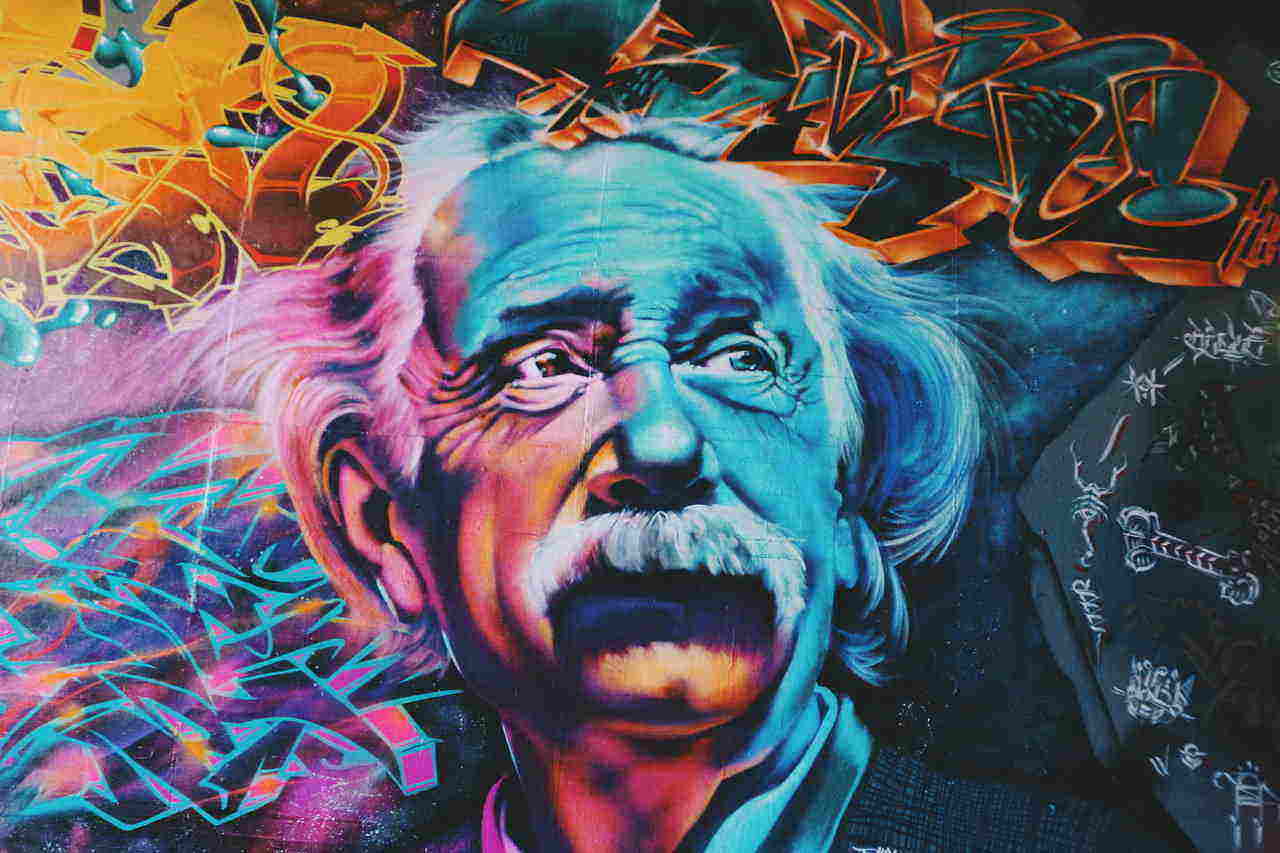
w3-hover-opacity

w3-hover-grayscale

w3-hover-sepia
Example
<img src="image.jpg" alt="Einstein" class="w3-hover-opacity">
<img src="image.jpg" alt="Einstein" class="w3-hover-grayscale">
<img src="image.jpg" alt="Einstein" class="w3-hover-sepia">
Try It Yourself »
Opacity Off
Add transparency on hover:

Remove transparency on hover:

The w3-hover-opacity class adds transparency to the image on mouse-over, and the w3-hover-opacity-off class removes transparency on mouse-over.
Example
<img src="snowtops.jpg" class="w3-hover-opacity" alt="Alps">
<img src="snowtops.jpg" class="w3-opacity w3-hover-opacity-off" alt="Alps">
Try It Yourself »
Constructing a Photo Album
In this example we use the W3.CSS Responsive Grid system to create a photo album that looks good on all devices. You will learn more about this later.
Summer 2015
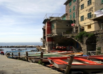
5 Terre
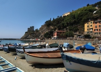
Monterosso
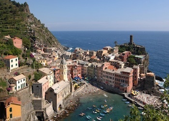
Vernazza
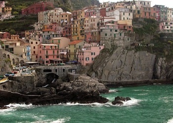
Manarola
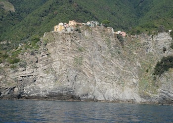
Corniglia
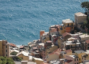
Riomaggiore
Example
<div class="w3-third">
<div class="w3-card">
<img src="img_monterosso.jpg" style="width:100%">
<div
class="w3-container">
<h4>Monterosso</h4>
</div>
</div>
</div>
Try It Yourself »

