Menu
×
   ❮   
HTML CSS JAVASCRIPT SQL PYTHON JAVA PHP HOW TO W3.CSS C C++ C# BOOTSTRAP REACT MYSQL JQUERY EXCEL XML DJANGO NUMPY PANDAS NODEJS DSA TYPESCRIPT SWIFT ANGULAR ANGULARJS GIT POSTGRESQL MONGODB ASP AI R GO KOTLIN SWIFT SASS VUE GEN AI SCIPY AWS CYBERSECURITY DATA SCIENCE INTRO TO PROGRAMMING HTML & CSS BASH RUST

Accessibility Quiz Results

Score: 0 of 25

0% Correct:


Question 1:

When was version 1.0 of the Web Content Accessibility Guidelines (WCAG) released?

2005
1995
1999    Correct answer  
2008

Question 2:

What is Wave?

An accessibility testing tool    Correct answer  
A screen reader
An organization of accessibility experts
An initiative by W3C

Question 3:

What is NVDA?

An accessibility testing tool
An initiative by W3C
A screen reader    Correct answer  
An organization of accessibility experts

Question 4:

According to World Health Organization, how many people live with a disability?

About 25 % or 2 000 000 000 people
About 15% or 1 000 000 000 people    Correct answer  
About 5% or 400 000 000 people

Question 5:

Audio and video captions will mostly benefit?

People with a broken arm
People with a heavy accent
People with hearing loss    Correct answer  

Question 6:

The top section of the Lyft website with a dashed border around the logo, search field and navigation.
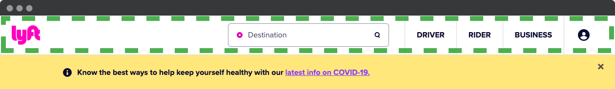
At the top of the Lyft website, there is a logo, a search field, three navigation items and a profile icon. Which landmark should be used for this section?

<nav>
<head>
<header>    Correct answer  
<top>

Question 7:

The top of the Lyft website, where the top right navigation is marked with a dashed border.
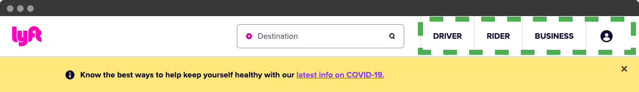
Still at the top, we have three navigation items and a profile icon. Which landmark should be used for this section?

<section>
None is needed, it is part of the <header>
<navigation>
<nav>    Correct answer  

Question 8:

The Lyft website has a banner about Covid beneath the top section.
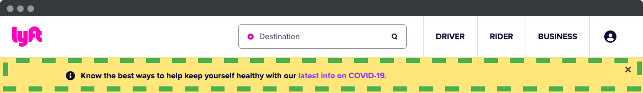
Under the top section is a banner about Covid. It is only visible on the front page of the site.
Which landmark should be used on the banner?

It should be inside <main>    Correct answer  
No landmark needed. It is a temporary message that can be closed.
<banner>
It should be inside <header>

Question 9:

Clicking the logo takes on a web site, takes you to the front page of that site. Should this be a <button> or an <a>?

<a>    Correct answer  
<button>

Question 10:

Clicking the menu icon, the "hamburger", opens a full screen menu overlay.
Should the menu icon be a <button> or a <a>?

<button>    Correct answer  
<a>

Question 11:

You write this code for the button "Sign up to ride":
<a href="https://account.lyft.com" class="basebutton">Sign up to ride</a>
Is this code considered accessible?

No, the class name basebutton indicates that this sould be a <button>
No, it looks like a button, so it should be coded as a <button>.
Yes, all good!    Correct answer  

Question 12:

This is the code for the button that opens the country dropdown, a bit simplified.

<button aria-label="Select phone number country code" aria-expanded="false" aria-controls="core-ui-id-5005823451-popover">     <img src="gb.svg">     <svg width="16" height="16" viewBox="0 0 16 16" style="fill: var(--core-ui-theme-icon-secondary,rgba(12,11,49,0.7));">         <path d="…"></path>     </svg> </button>
Does this control has a valid role?

No, the button is missing role="dropdown"
No, the button is missing role="button"
No, the button is missing role="listbox"
Yes, a <button> has role="button" as default    Correct answer  

Question 13:

Screenshot showing the white text Delivered on top of an image background.
In this example, we see white text on an image background.
How should you measure this contrast?

Not possible. Text on images is not accessible.
Find the lightest part of the picture that might lie next to    Correct answer  
Find the average color of the image, to measure against.

Question 14:

Screenshot from Facebook for developers, showing a table where status sent is shown with green color.
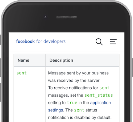
This table shows the status of Facebook messages.
The status "sent" is written in green. Is that accessible?

Yes, color is not used alone. The text sent is sufficient.    Correct answer  
No, color as meaning is not accessible for color blind users.

Question 15:

Screenshot from AliExpress showing the Logo, search field and category icons with text.
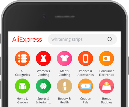
This screenshot shows AliExpress with a logo, a search field and category icons.
Is the logo a meaningful image?

No, the logo is decorative. The user already knows that this is AliExpress from the title and the address.
Yes, the logo tells the users which site it is and offers a link to the front page.    Correct answer  

Question 16:

Screenshot from AliExpress showing a toilet seat cover
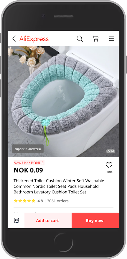
This screenshot from AliExpress shows an icon of a magnifying glass at the top.
What would be the best descriptive text?

Open search    Correct answer  
None. It should be empty. The user understands that this is search.
Search
"Black icon of a magnifying glass"

Question 17:

Screenshot of a navigation link in a hover state, with a solid red background
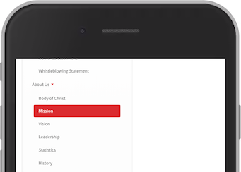
The navigation link "Mission" is showed in a hover state.
(Ignore the fact that hover states are not common on phones)
The background is #dc2c30. What are possible problems with this hover state?

Text size is too small
The contrast is insufficient
No problems    Correct answer  
It uses color alone to tell the state

Question 18:

Screenshot from The Salvation Army, showing a text block with the link founded in 1865 by William Booth.
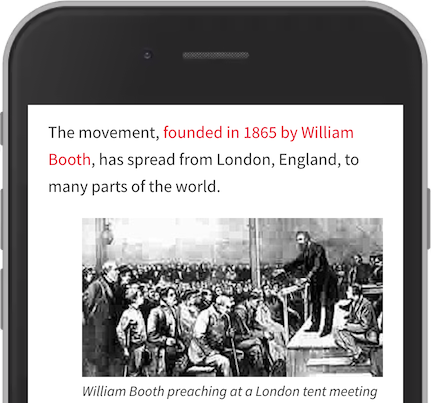
This screenshot is from The Salvation Army. The text "founded in 1865 by William Booth" is a link. This is a good link text because it indicates that the link takes us to the history of the army.

True    Correct answer  
False

Question 19:

Screenshot from India Today, showing three article headings. The first is the biggest.
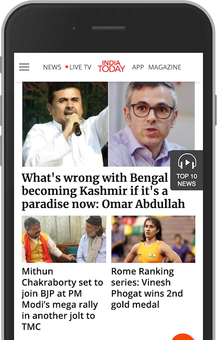
This screenshot from India Today shows three news articles. The structure is: <h1>News <h2>What is wrong with... <h3>Mithun Chakraborty set to join.... <h3>Rome Ranking series: Vinesh Phogat wins 2nd gold medal
Is this a good outline?

Yes. The <h2> is the most important one.
No, the two <h3>s are not subheadings of the <h2>. They are not related at all. They should be <h2>s.    Correct answer  

Question 20:

Screenshot showing a focused link with an image, with only left- and right border as visual focus.
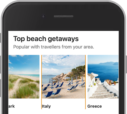
In this example from Booking, the link to Italy is focused. They have relied on the browser default styling. However, the outline is only on the left and right side of the linked section. What might be a reason that there is no outline at the top and bottom?

overflow: hidden;    Correct answer  
outline-top: 0; and outline-bottom: 0;

Question 21:

Screenshot from Honda, showing the logo in a focused state.
Opening the Honda web site, a screen reader will read the first interactive element as something like:
link, image, aitch tee tee pee ess colon slash slash double-u double-u double-u dot honda dot com slash (link, image, https://www.honda.com/)
Why do we hear this?

The image is missing alternative text.    Correct answer  
The site has not implemented aria attributes to support screen readers.
A screen reader will always read the destination of a link.

Question 22:

Screenshot from a chat, showing a text field with the placeholder Type your question. Text field in focus.
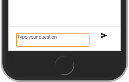
In this example from a chat window, the "Type your question" textarea is coded like this: <textarea id="textarea" tabindex="0" placeholder="Type your question" aria-invalid="false"></textarea>
Is this textarea accessible?

No, it is missing a valid label. Placeholder is not a valid label.    Correct answer  
Yes
No, it has tabindex="0" that disable keyboard access

Question 23:

Screenshot showing a input field for zip code.
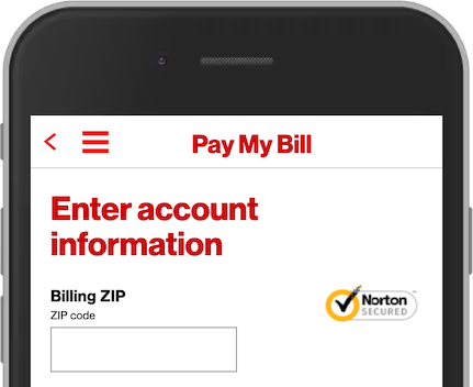
This example has a input field for zip code, with the autocomplete attribute: <input type="tel" inputmode="numeric" pattern="[0-9]*" id="txtZip" name="sessionVO.zip" autocomplete="off">
Is this a correct way of using autocomplete?

Yes
No, it should be autocomplete="zip-code"
No, it should be autocomplete="postal-code"    Correct answer  
No, it should be autocomplete="false" instead of autfocomplete="off"

Question 24:

Screenshot from a product spesification, with large heading and small text in a table.
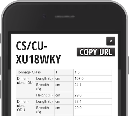
In this example, the user has increased the text size in the browser. However not all text in this product spesification is increased. The heading and the button Copy URL is big, but not the details.
What is the reason that the text in the table is still small?

The font-size is set with em.
The font-size is set with px.    Correct answer  
The font-size is not set for the table.
The table width is fixed.

Question 25:

The top meny has share icons of various quality.
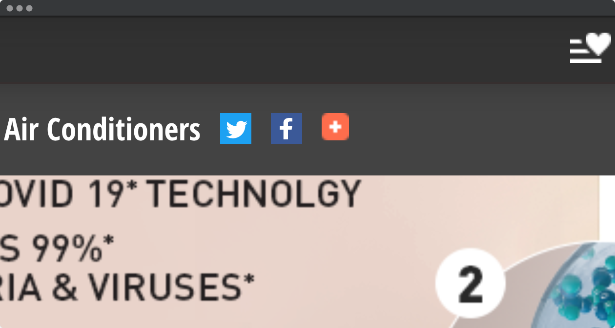
In this example, the user has increased size in the browser. The top of the page have four icons. The Twitter and the Facebook icons are sharp. The share and the favourite icon are pixelated. <a href="my-favorites.html"><img src="icn-wishlist.png" alt="My Favorites"></a>
What can be improved here?

The width and height should be set at the <img>.
The icon should be a vector graphic, like SVG.    Correct answer  
The icon should be a button, not a link.

Kickstart your career

Get certified by completing the course

Get certified w3schools CERTIFIED . 2025

×

Contact Sales

If you want to use W3Schools services as an educational institution, team or enterprise, send us an e-mail:
sales@w3schools.com

Report Error

If you want to report an error, or if you want to make a suggestion, send us an e-mail:
help@w3schools.com

W3Schools is optimized for learning and training. Examples might be simplified to improve reading and learning. Tutorials, references, and examples are constantly reviewed to avoid errors, but we cannot warrant full correctness of all content. While using W3Schools, you agree to have read and accepted our terms of use, cookies and privacy policy.

Copyright 1999-2025 by Refsnes Data. All Rights Reserved. W3Schools is Powered by W3.CSS.