Menu
×
   ❮     
HTML CSS JAVASCRIPT SQL PYTHON JAVA PHP HOW TO W3.CSS C C++ C# BOOTSTRAP REACT MYSQL JQUERY EXCEL XML DJANGO NUMPY PANDAS NODEJS R TYPESCRIPT ANGULAR GIT POSTGRESQL MONGODB ASP AI GO KOTLIN SASS VUE DSA GEN AI SCIPY AWS CYBERSECURITY DATA SCIENCE
     ❯   

CSS Tutorial

CSS HOME CSS Introduction CSS Syntax CSS Selectors CSS How To CSS Comments CSS Colors CSS Backgrounds CSS Borders CSS Margins CSS Padding CSS Height/Width CSS Box Model CSS Outline CSS Text CSS Fonts CSS Icons CSS Links CSS Lists CSS Tables CSS Display CSS Max-width CSS Position CSS Z-index CSS Overflow CSS Float CSS Inline-block CSS Align CSS Combinators CSS Pseudo-class CSS Pseudo-element CSS Opacity CSS Navigation Bar CSS Dropdowns CSS Image Gallery CSS Image Sprites CSS Attr Selectors CSS Forms CSS Counters CSS Website Layout CSS Units CSS Specificity CSS !important CSS Math Functions

CSS Advanced

CSS Rounded Corners CSS Border Images CSS Backgrounds CSS Colors CSS Color Keywords CSS Gradients CSS Shadows CSS Text Effects CSS Web Fonts CSS 2D Transforms CSS 3D Transforms CSS Transitions CSS Animations CSS Tooltips CSS Style Images CSS Image Reflection CSS object-fit CSS object-position CSS Masking CSS Buttons CSS Pagination CSS Multiple Columns CSS User Interface CSS Variables CSS Box Sizing CSS Media Queries CSS MQ Examples CSS Flexbox

CSS Responsive

RWD Intro RWD Viewport RWD Grid View RWD Media Queries RWD Images RWD Videos RWD Frameworks RWD Templates

CSS Grid

Grid Intro Grid Container Grid Item

CSS SASS

SASS Tutorial

CSS Examples

CSS Templates CSS Examples CSS Editor CSS Snippets CSS Quiz CSS Exercises CSS Website CSS Bootcamp CSS Certificate

CSS References

CSS Reference CSS Selectors CSS Functions CSS Reference Aural CSS Web Safe Fonts CSS Animatable CSS Units CSS PX-EM Converter CSS Colors CSS Color Values CSS Default Values CSS Browser Support

CSS Masking


With CSS masking you create a mask layer to place over an element to partially or fully hide portions of the element.


The CSS mask-image Property

The CSS mask-image property specifies a mask layer image.

The mask layer image can be a PNG image, an SVG image, a CSS gradient, or an SVG <mask> element.


Browser Support

Note: Most browsers only have partial support for CSS masking. You will need to use the -webkit- prefix in addition to the standard property in most browsers.

The numbers in the table below specify the first browser version that fully supports the property. Numbers followed by -webkit- specify the first version that worked with a prefix.

Property
mask-image 4.0 -webkit- 79.0 -webkit- 53.0 4.0 -webkit- 15.0 -webkit-

Use an Image as the Mask Layer

To use a PNG or an SVG image as the mask layer, use a url() value to pass in the mask layer image.

The mask image needs to have a transparent or semi-transparent area. Black indicates fully transparent.

Here is the mask image (a PNG image) we will use:

W3Schools.com

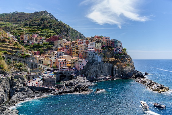
Here is an image from Cinque Terre, in Italy:

Cinque Terre

Now, we apply the mask image (the PNG image above) as the mask layer for the image from Cinque Terre, Italy:

Cinque Terre

Example

Here is the source code:

.mask1 {
  -webkit-mask-image: url(w3logo.png);
  mask-image: url(w3logo.png);
  -webkit-mask-repeat: no-repeat;
  mask-repeat: no-repeat;
}
Try it Yourself »

Example Explained

The mask-image property specifies the image to be used as a mask layer for an element.

The mask-repeat property specifies if or how a mask image will be repeated. The no-repeat value indicates that the mask image will not be repeated (the mask image will only be shown once).

Another Example

If we omit the mask-repeat property, the mask image will be repeated all over the image from Cinque Terre, Italy:

Cinque Terre

Example

Here is the source code:

.mask1 {
  -webkit-mask-image: url(w3logo.png);
  mask-image: url(w3logo.png);
}
Try it Yourself »


Use Gradients as the Mask Layer

CSS linear and radial gradients can also be used as mask images.

Linear Gradient Examples

Here, we use a linear-gradient as the mask layer for our image. This linear gradient goes from top (black) to bottom (transparent):

Cinque Terre
 

Example

Use a linear gradient as a mask layer:

.mask1 {
  -webkit-mask-image: linear-gradient(black, transparent);
  mask-image: linear-gradient(black, transparent);
}
Try it Yourself »

Here, we use a linear-gradient along with text masking as the mask layer for our image:

The Cinque Terre is a coastal area within Liguria, in the northwest of Italy. It lies in the west of La Spezia Province, and comprises five villages: Monterosso al Mare, Vernazza, Corniglia, Manarola, and Riomaggiore.

The Cinque Terre is a coastal area within Liguria, in the northwest of Italy. It lies in the west of La Spezia Province, and comprises five villages: Monterosso al Mare, Vernazza, Corniglia, Manarola, and Riomaggiore.

The Cinque Terre is a coastal area within Liguria, in the northwest of Italy. It lies in the west of La Spezia Province, and comprises five villages: Monterosso al Mare, Vernazza, Corniglia, Manarola, and Riomaggiore.

Example

Use a linear gradient along with text masking as a mask layer:

.mask1 {
  max-width: 600px;
  height: 350px;
  overflow-y: scroll;
  background: url(img_5terre.jpg) no-repeat;
  -webkit-mask-image: linear-gradient(black, transparent);
  mask-image: linear-gradient (black, transparent);
}
Try it Yourself »

Radial Gradient Examples

Here, we use a radial-gradient (shaped as a circle) as the mask layer for our image:

Cinque Terre

Example

Use a radial gradient as a mask layer (a circle):

.mask2 {
  -webkit-mask-image: radial-gradient(circle, black 50%, rgba(0, 0, 0, 0.5) 50%);
  mask-image: radial-gradient(circle, black 50%, rgba(0, 0, 0, 0.5) 50%);
}
Try it Yourself »

Here, we use a radial-gradient (shaped as an ellipse) as the mask layer for our image:

Cinque Terre

Example

Use another radial gradient as a mask layer (an ellipse):

.mask3 {
  -webkit-mask-image: radial-gradient(ellipse, black 50%, rgba(0, 0, 0, 0.5) 50%);
  mask-image: radial-gradient(ellipse, black 50%, rgba(0, 0, 0, 0.5) 50%);
}
Try it Yourself »

Use SVG as the Mask Layer

The SVG <mask> element can be used inside an SVG graphic to create masking effects.

Here, we use the SVG <mask> element to create different mask layers for our image:

Sorry, your browser does not support inline SVG.

Example

An SVG mask layer (formed as a triangle):

<svg width="600" height="400">
  <mask id="svgmask1">
    <polygon fill="#ffffff" points="200 0, 400 400, 0 400"></polygon>
  </mask>
  <image xmlns:xlink="http://www.w3.org/1999/xlink" xlink:href="img_5terre.jpg" mask="url(#svgmask1)"></image>
</svg>
Try it Yourself »
Sorry, your browser does not support inline SVG.

Example

An SVG mask layer (formed as a star):

<svg width="600" height="400">
  <mask id="svgmask2">
    <polygon fill="#ffffff" points="100,10 40,198 190,78 10,78 160,198"></polygon>
  </mask>
  <image xmlns:xlink="http://www.w3.org/1999/xlink" xlink:href="img_5terre.jpg" mask="url(#svgmask2)"></image>
</svg>
Try it Yourself »
Sorry, your browser does not support inline SVG.

Example

An SVG mask layer (formed as circles):

<svg width="600" height="400">
  <mask id="svgmask3">
    <circle fill="#ffffff" cx="75" cy="75" r="75"></circle>
    <circle fill="#ffffff" cx="80" cy="260" r="75"></circle>
    <circle fill="#ffffff" cx="270" cy="160" r="75"></circle>
  </mask>
  <image xmlns:xlink="http://www.w3.org/1999/xlink" xlink:href="img_5terre.jpg" mask="url(#svgmask3)"></image>
</svg>
Try it Yourself »

CSS Masking Properties

The following table lists all the CSS masking properties:

Property Description
mask-image Specifies an image to be used as a mask layer for an element
mask-mode Specifies whether the mask layer image is treated as a luminance mask or as an alpha mask
mask-origin Specifies the origin position (the mask position area) of a mask layer image
mask-position Sets the starting position of a mask layer image (relative to the mask position area)
mask-repeat Specifies how the mask layer image is repeated
mask-size Specifies the size of a mask layer image

×

Contact Sales

If you want to use W3Schools services as an educational institution, team or enterprise, send us an e-mail:
sales@w3schools.com

Report Error

If you want to report an error, or if you want to make a suggestion, send us an e-mail:
help@w3schools.com

W3Schools is optimized for learning and training. Examples might be simplified to improve reading and learning. Tutorials, references, and examples are constantly reviewed to avoid errors, but we cannot warrant full correctness of all content. While using W3Schools, you agree to have read and accepted our terms of use, cookie and privacy policy.

Copyright 1999-2024 by Refsnes Data. All Rights Reserved. W3Schools is Powered by W3.CSS.