CSS Fixed Horizontal Navbar
This page covers fixed, sticky, and responsive horizontal navigation bars.
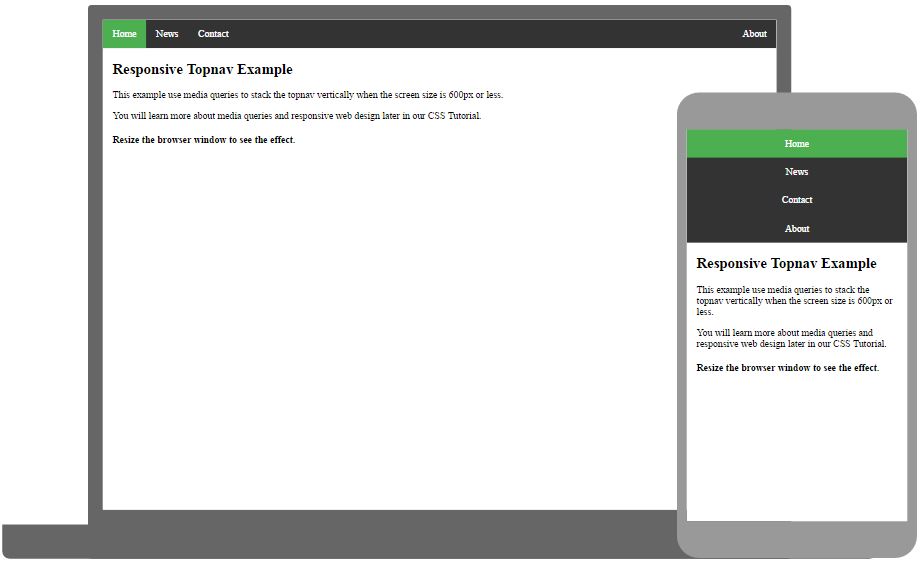
Right-align One Link
You can right-align one or more links by floating the list items to the right (float: right;):
Example
<ul>
<li><a href="#home" class="active">Home</a></li>
<li><a href="#news">News</a></li>
<li><a href="#contact">Contact</a></li>
<li style="float:right"><a href="#about">About</a></li>
</ul>
Try it Yourself »
Border Dividers
Add the border-right property to <li>
elements (to all <li>s, except the last), to create link dividers:
Example
/* Add a lightgray right border to all list items, except the last */
ul li {
float: left;
border-right: 1px solid #bbbbbb;
}
ul
li:last-child {
border-right: none;
}
Try it Yourself »
Fixed Navigation Bar
You can make the navigation bar to stay fixed at the top or at the bottom of
a page, by using the
position property along with
top or
bottom:
Note: Fixed position might not work properly on mobile devices.
Sticky Navigation Bar
Add position: sticky; to <ul> to create a sticky navbar.
An element with position: sticky; toggles between
a relative and fixed
position, depending on the scroll position.
A sticky element is positioned relative until a certain scroll position is reached - then it "sticks" in that place (like position: fixed).
Note: You must specify at least one of the top, right, bottom or left
properties, for
sticky positioning to work.
Dropdown Menu in Navigation Bar
Here we create a dropdown menu for one of the menu links: