Menu
×
   ❮   
HTML CSS JAVASCRIPT SQL PYTHON JAVA PHP HOW TO W3.CSS C C++ C# BOOTSTRAP REACT MYSQL JQUERY EXCEL XML DJANGO NUMPY PANDAS NODEJS R TYPESCRIPT ANGULAR GIT POSTGRESQL MONGODB ASP AI GO KOTLIN SASS VUE DSA GEN AI SCIPY AWS CYBERSECURITY DATA SCIENCE
     ❯   

MongoDB Charts


MongoDB Charts

MongoDB Charts lets you visualize your data in a simple, intuitive way.


MongoDB Charts Setup

From the MongoDB Atlas dashboard, go to the Charts tab.

If you've never used Charts before, click the Activate Now button. This will take about 1 minute to complete.

You'll see a new dashboard. Click the dashboard name to open it.


Creating a Chart

Create a new chart by clicking the Add Chart button.

Visually creating a chart is intuitive. Select the data sources that you want to use.


Example:

In this example, we are using the "sample_mflix" database loaded from our sample data in the Intro to Aggregations section.

Under Data Source, select the Movies collection.

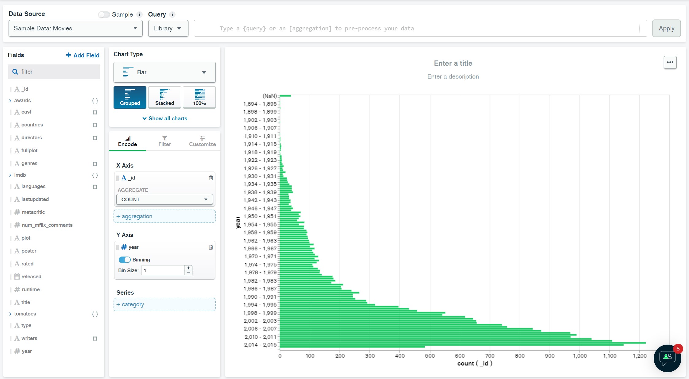
Let's visualize how many movies were released in each year.

Drag the Year field to the Y Axis field and set the Bin Size to 1.

Drag the _id field to the X Axis field and make sure COUNT is selected for the Aggregate.

You should now see a bar chart with the number of movies released in each year.


×

Contact Sales

If you want to use W3Schools services as an educational institution, team or enterprise, send us an e-mail:
sales@w3schools.com

Report Error

If you want to report an error, or if you want to make a suggestion, send us an e-mail:
help@w3schools.com

W3Schools is optimized for learning and training. Examples might be simplified to improve reading and learning. Tutorials, references, and examples are constantly reviewed to avoid errors, but we cannot warrant full correctness of all content. While using W3Schools, you agree to have read and accepted our terms of use, cookie and privacy policy.

Copyright 1999-2024 by Refsnes Data. All Rights Reserved. W3Schools is Powered by W3.CSS.