Accessibility Buttons & Links
Why
Buttons and links are specific types of interactive components. Each of them work differently with assistive technologies. The correct use of each component helps users with assistive technologies to interact with the component.
What
The <button> element should be used for any interaction that performs an action on the current page. The <a> element should be used for any interaction that navigates to another view.
How
In the introduction, we saw that the visual design does not dictate which HTML element we should use. A link that looks like a button, but behaves like a link, is an <a>.

Both the "button" Sign up to drive and the link underneath is coded as an <a>. So when should we use a <button>, then?
Let us take a closer look at the website of Uber. The first section of the header has five elements – a logo, a dropdown menu and three links. One of them is coded as a <button>.
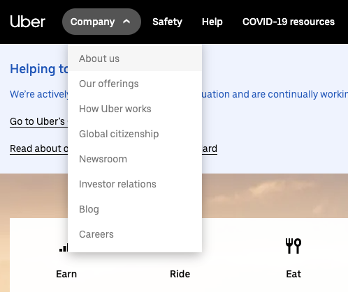
Clicking Company opens a drop down menu. This is an interaction that performs an action on the current page. Using <button> here is the correct thing to do. The underlying links, About us, Our offerings and so on, are correctly coded with <a> elements.
The arrow indicates that this is a button with a dropdown menu, that changes direction when opened. This is a nice extra visual cue.
One benefit with this, is that semantic HTML gives context to screen readers, which read the contents of a page out loud. You will learn more about screen readers in module 7 about assistive technologies.
In this case, a <div> is wrong. Why?
- Buttons have more suitable styling by default.
- A screen reader identifies it as a button.
- It is focusable.
- It is clickable.
Both a link and a button are accessible for people relying on keyboard-only navigation; it can be clickable with both mouse and keys, and it can be tabbed between using the tab key on the keyboard.
Now you know when to use a <button> and when to use an <a>. What else should you keep in mind?
Proper links
Links take users from one page to another, or sometimes to another part of the page. For a link to be accessible, remember to:
- Use the
hrefattribute to specify the link destination. - Use a proper URL in the
hrefattribute. The URL can be absolute or relative. https://uber.com/about is an absolute URL. /about is a relative URL. - Not simulate a link with other elements like
<span>or<div>. - Open the link in the current window. It is not recommended to open links in a new window.
The link About us from the Uber example is coded like this, a bit simplified:
<a href="/about/">About us</a>
This is a proper and healthy link.

