Vue Props
Props is a configuration option in Vue.
With props we can pass data to the components via custom attributes to the component tag.
Pass Data To a Component
Do you remember the example on the previous page where all three components said 'Apple'? With props we can now pass data down to our components to give them different content and make them look different.
Let's make a simple page to show 'Apples', 'Pizza' and 'Rice'.
In the main application file App.vue we create our own attribute 'food-name' to pass a prop with the <food-item/> component tags:
App.vue:
<template>
  <h1>Food</h1>
  <food-item food-name="Apples"/>
  <food-item food-name="Pizza"/>
  <food-item food-name="Rice"/>
</template>

<script></script>

<style>
  #app > div {
    border: dashed black 1px;
    display: inline-block;
    width: 120px;
    margin: 10px;
    padding: 10px;
    background-color: lightgreen;
  }
</style>
Receive Data Inside a Component
To receive the data sent via the 'food-item' attribute from App.vue we use this new 'props' configuration option. We list the attributes received so that our component *.vue file knows about them, and now we can use the props wherever we want in the same way as we use a data property.
FoodItem.vue:
<script>
  export default {
    props: [
      'foodName'
    ]
  }
</script>
Props attributes are written with a dash - to separate words (kebab-case) in the <template> tag, but kebab-case is not legal in JavaScript. So instead we need to write the attribute names as
camel Case in JavaScript, and Vue understands this automatically!
Finally, our example with <div> elements for 'Apples', 'Pizza' and 'Rice' looks like this:
Example
App.vue:
<template>
  <h1>Food</h1>
  <food-item food-name="Apples"/>
  <food-item food-name="Pizza"/>
  <food-item food-name="Rice"/>
</template>FoodItem.vue:
<template>
  <div>
    <h2>{{ foodName }}</h2>
  </div>
</template>

<script>
  export default {
    props: [
      'foodName'
    ]
  }
</script>

<style></style>Soon we will see how to pass different data types as props attributes to components, but before we do that, let's expand our code with a description of each type of food, and put the food <div> elements inside a Flexbox wrapper.
Example
App.vue:
<template>
  <h1>Food</h1>
  <div id="wrapper">
    <food-item
      food-name="Apples"
      food-desc="Apples are a type of fruit that grow on trees."/>
    <food-item
      food-name="Pizza"
      food-desc="Pizza has a bread base with tomato sauce, cheese, and toppings on top."/>
    <food-item
      food-name="Rice"
      food-desc="Rice is a type of grain that people like to eat."/>
  </div>
</template>

<script></script>

<style>
  #wrapper {
    display: flex;
    flex-wrap: wrap;
  }
  #wrapper > div {
    border: dashed black 1px;
    margin: 10px;
    padding: 10px;
    background-color: lightgreen;
  }
</style>FoodItem.vue:
<template>
  <div>
    <h2>{{ foodName }}</h2>
    <p>{{ foodDesc }}</p>
  </div>
</template>

<script>
  export default {
    props: [
      'foodName',
      'foodDesc'
    ]
  }
</script>

<style></style>Boolean Props
We can achieve different functionality by passing props of different data types, and we are able to define rules for how attributes are given when components are created from App.vue.
Let's add a new prop 'isFavorite'. This should be a boolean prop with value either true or false so that we can use it directly with v-show to display a favorite stamp <img> tag if the food is considered a favorite.
To pass props with a data type different to String, we must write v-bind: in front of the attribute we want to pass.
This is how we pass the boolean 'isFavorite' prop from App.vue as an attribute 'is-favorite':
App.vue:
<template>
<h1>Food</h1>
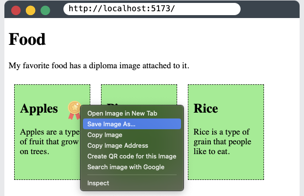
<p>My favorite food has a diploma image attached to it.</p>
<div id="wrapper">
<food-item
food-name="Apples"
food-desc="Apples are a type of fruit that grow on trees."
v-bind:is-favorite="true"/>
<food-item
food-name="Pizza"
food-desc="Pizza has a bread base with tomato sauce, cheese, and toppings on top."
v-bind:is-favorite="false"/>
<food-item
food-name="Rice"
food-desc="Rice is a type of grain that people like to eat."
v-bind:is-favorite="false"/>
</div>
</template>We receive the boolean 'isFavorite' prop inside FoodItem.vue and show a favorite stamp if the food is considered favorite:
Example
FoodItem.vue:
<template>
  <div>
    <h2>
      {{ foodName }}
      <img src="/img_quality.svg" v-show="isFavorite">
    </h2>
    <p>{{ foodDesc }}</p>
  </div>
</template>

<script>
  export default {
      props: ['foodName','foodDesc','isFavorite']
  }
</script>

<style>
  img {
    height: 1.5em;
    float: right;
  }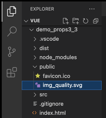
</style>Images: To make the image in the example above work locally in the project on your machine, open the example above, right click the image, choose "Save Image As..." and save it in the "public" folder in your project.
Props Interface
In the example above, based on the code inside FoodItem.vue, we cannot know for sure that we receive the 'isFavorite' prop, and we cannot know for sure if it is a boolean value. To help us with this we can define the data-type of props we receive, we can set props to be required, and we can even make validation functions to validate the props we receive.
Defining props we receive serves as a documentation for other people if you work in a team, and it provides us with warnings in the console if the rules that we have defined are broken.
Props as an Object
In FoodItem.vue, we comment out how we defined the props in an array to have it as reference, and instead define the props in an object. We can also define the data type of each prop in addition to the prop name, like this:
FoodItem.vue:
<script>
  export default {
    // props: ['foodName','foodDesc','isFavorite']
    props: {
      foodName: String,
      foodDesc: String,
      isFavorite: Boolean
    }
  }
</script>
With props defined in this way, other people can look inside FoodItem.vue and easily see what the component expects.
If a component is created from the parent element (in our case App.vue) and given a prop with the wrong data type, you get a warning in the console, like this:
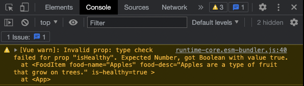
Such warnings are useful to let ourselves and others know that a component is not used how it is supposed to, and to tell what is wrong so that we can correct the mistake.
Required Props
To tell Vue that a prop is required we need to define the prop as an object. Let's make the prop 'foodName' required, like this:
FoodItem.vue:
<script>
  export default {
    // props: ['foodName','foodDesc','isFavorite']
    props: {
      foodName: {
        type: String,
        required: true
      },
      foodDesc: String,
      isFavorite: Boolean
    }
  }
</script>
If a component is created from the parent element (in our case App.vue) and a required prop is not defined, you get a warning in the console, like this:
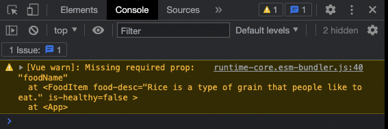
Such warnings are useful to let ourselves and others know that a component is not used how it is supposed to, and to tell what is wrong so that we can correct the mistake.
Default Value
We can set a default value for a prop.
Let's create a default value for the 'foodDesc' prop in the 'FoodItem' component, and then create such an item for rice without defining the 'foodDesc' prop:
Example
App.vue:
<template>
  <h1>Food</h1>
  <p>My favorite food has a diploma image attached to it.</p>
  <div id="wrapper">
    <food-item
      food-name="Apples"
      food-desc="Apples are a type of fruit that grow on trees."
      v-bind:is-favorite="true"/>
    <food-item
      food-name="Pizza"
      food-desc="Pizza has a bread base with tomato sauce, cheese, and toppings on top."
      v-bind:is-favorite="false"/>
    <food-item
      food-name="Rice"
      food-desc="Rice is a type of grain that people like to eat."
      v-bind:is-favorite="false"/>
  </div>
</template>FoodItem.vue:
<script>
  export default {
    props: {
      foodName: {
        type: String,
        required: true
      },
      foodDesc: {
        type: String,
        required: false,
        default: 'This is the default description.'
      },
      isFavorite: {
        type: Boolean,
        required: false,
        default: false
      }
    }
  }
</script>Props Validator Function
We can also define a validator function that decides if the prop value is valid or not.
Such validator functions must return either true or false. When the validator returns false, it means the prop value is invalid. An invalid prop value generates a warning in the browser console when we run our page in developer mode, and the warning is a useful hint to make sure the components are used as intended.
Let's say we want the food description to be a certain length, between 20 and 50 characters. We can add a validator function to make sure the food description provided has a valid length.
FoodItem.vue:
<script>
export default {
props: {
foodName: {
type: String,
required: true
},
foodDesc: {
type: String,
required: false,
default: 'This is the default description.',
validator: function(value) {
if( 20<value.length && value.length<50 ) {
return true;
}
else {
return false;
}
}
},
isFavorite: {
type: Boolean,
required: false,
default: false
}
}
}
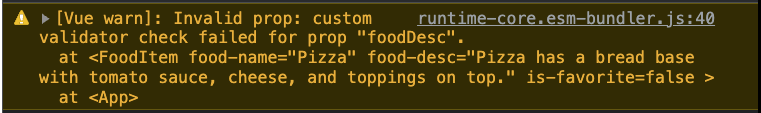
</script>Note: If you add the validator code above to your local project, you will get a warning in development mode because the food description for pizza is 65 characters, which is 15 characters longer than the validator function allows.
Modify Props
When a component is created in the parent element we are not allowed to change the value of the prop received in the child element. So inside FoodItem.vue we cannot change the value of the 'isFavorite' prop we get from App.vue. The prop is read-only from the parent, which is App.vue in our case.
But let's say we want the user to be able to change what food is considered favorite by clicking a button. Now there is a need to change the 'isFavorite' prop, but we cannot do it because it is read only.
We are not allowed to change 'isFavorite'. This will generate an error.
methods: {
  toggleFavorite() {
    this.isFavorite = !this.isFavorite;
  }
}
To get around this we can use the prop to initialize a new data value 'foodIsFavorite', inside FoodItem.vue, like this:
data() {
  return {
    foodIsFavorite: this.isFavorite
  }
}
And now we can add a method so the user can toggle this new data value:
methods: {
  toggleFavorite() {
    this.foodIsFavorite = !this.foodIsFavorite;
  }
}
We must also add the toggle button to each food item, and change v-show in the <img> tag to depend on the new data property 'foodIsFavorite'. And to make our example simpler we also slim down the props declaration to just an array.
Example
FoodItem.vue:
<template>
  <div>
    <h2>
      {{ foodName }}
      <img src="/img_quality.svg" v-show="foodIsFavorite">
    </h2>
    <p>{{ foodDesc }}</p>
    <button v-on:click="toggleFavorite">Favorite</button>
  </div>
</template>

<script>
export default {
  props: ['foodName','foodDesc','isFavorite'],
  data() {
    return {
      foodIsFavorite: this.isFavorite
    }
  },
  methods: {
    toggleFavorite() {
      this.foodIsFavorite = !this.foodIsFavorite;
    }
  }
};
</script>

<style>
  img {
    height: 1.5em;
    float: right;
  }
</style>
