R Pie Charts
Pie Charts
A pie chart is a circular graphical view of data.
Use the pie() function to draw pie charts:
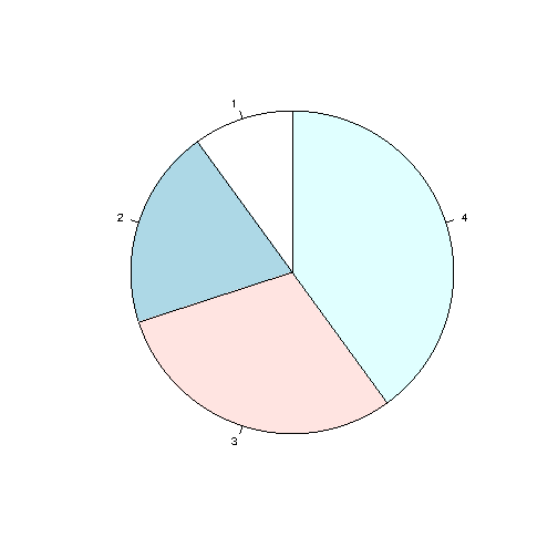
Example
# Create a vector of pies
x <- c(10,20,30,40)
# Display
the pie chart
pie(x)
Result:

Example Explained
As you can see the pie chart draws one pie for each value in the vector (in this case 10, 20, 30, 40).
By default, the plotting of the first pie starts from the x-axis and move counterclockwise.
Note: The size of each pie is determined by comparing the value with all the other values, by using this formula:
The value divided by the sum of all values: x/sum(x)
Start Angle
You can change the start angle of the pie chart with the init.angle parameter.
The value of init.angle is defined with angle in degrees, where default angle is 0.
Example
Start the first pie at 90 degrees:
# Create a vector of pies
x <- c(10,20,30,40)
# Display
the pie chart and start the first pie at 90 degrees
pie(x, init.angle = 90)
Result:
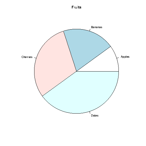
Labels and Header
Use the label parameter to add a label to the pie chart,
and use the main
parameter to add a header:
Example
# Create a vector of pies
x <- c(10,20,30,40)
# Create a vector of labels
mylabel <- c("Apples",
"Bananas", "Cherries", "Dates")
# Display
the pie chart with labels
pie(x, label = mylabel, main = "Fruits")
Result:
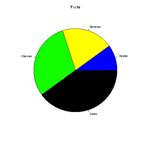
Colors
You can add a color to each pie with the col parameter:
Example
# Create a vector of colors
colors <- c("blue", "yellow", "green", "black")
# Display the pie chart
with colors
pie(x, label = mylabel, main =
"Fruits", col = colors)
Result:
Legend
To add a list of explanation for each pie, use the legend() function:
Example
# Create a vector of labels
mylabel <- c("Apples", "Bananas", "Cherries",
"Dates")
# Create a vector of colors
colors <- c("blue", "yellow",
"green", "black")
# Display the pie chart with
colors
pie(x, label = mylabel,
main = "Pie Chart", col = colors)
# Display the explanation box
legend("bottomright", mylabel, fill = colors)
Result:
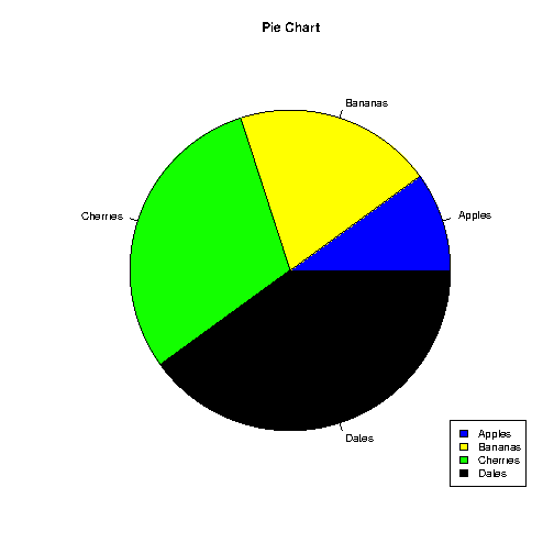
The legend can be positioned as either:
bottomright,
bottom,
bottomleft,
left,
topleft,
top,
topright,
right,
center
