R Plotting
Plot
The plot() function is used to draw points (markers) in a diagram.
The function takes parameters for specifying points in the diagram.
Parameter 1 specifies points on the x-axis.
Parameter 2 specifies points on the y-axis.
At its simplest, you can use the plot() function to plot two numbers against each other:
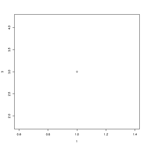
Example
Draw one point in the diagram, at position (1) and position (3):
plot(1, 3)
Result:
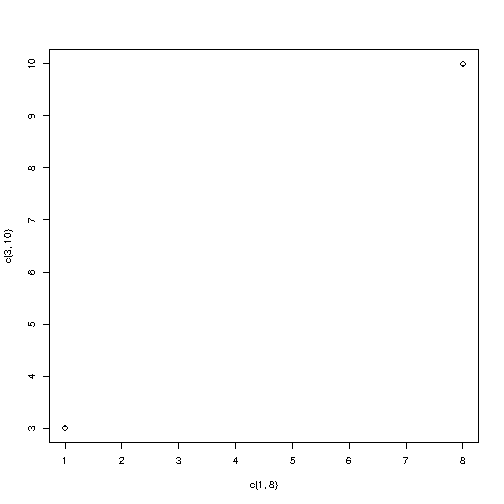
To draw more points, use vectors:
Example
Draw two points in the diagram, one at position (1, 3) and one in position (8, 10):
plot(c(1, 8), c(3, 10))
Result:
Multiple Points
You can plot as many points as you like, just make sure you have the same number of points in both axis:
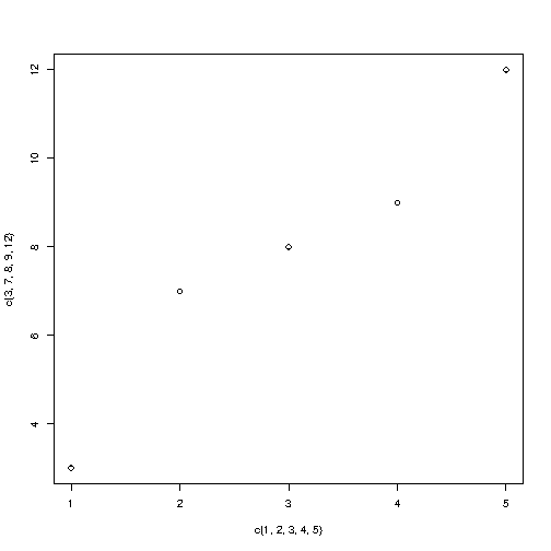
For better organization, when you have many values, it is better to use variables:
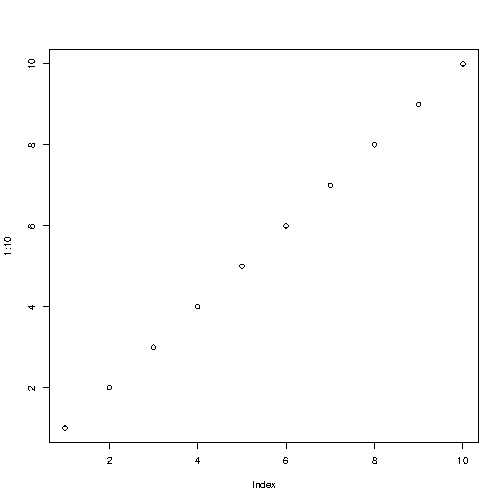
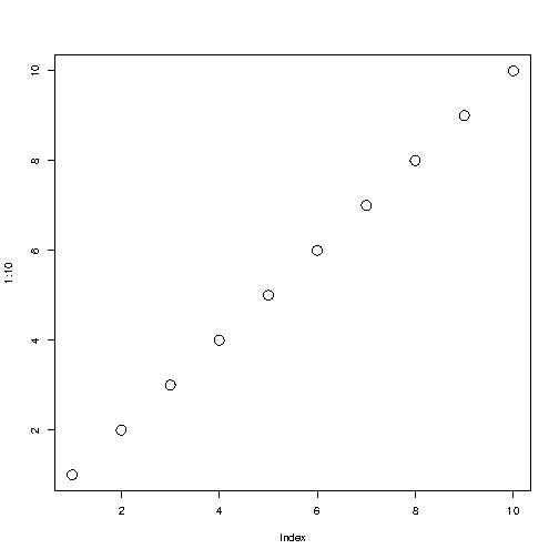
Sequences of Points
If you want to draw dots in a sequence, on both the x-axis and the y-axis, use the : operator:
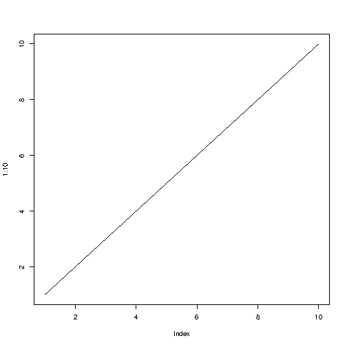
Draw a Line
The plot() function also takes a type parameter with the value l to draw a line to connect all the points in
the diagram:
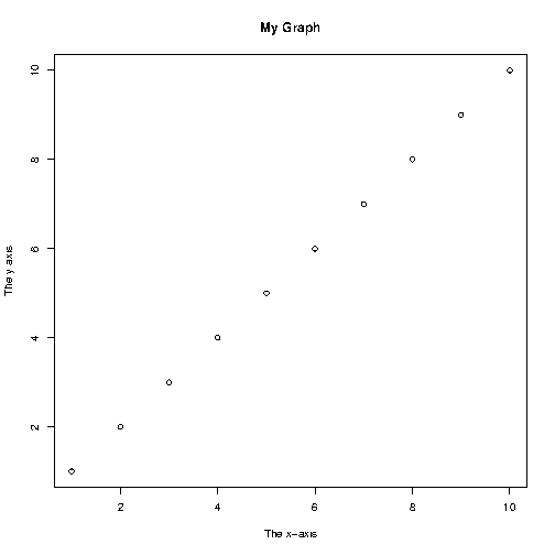
Plot Labels
The plot() function also accept other parameters,
such as main, xlab and ylab
if you want to customize the graph with a main title and different labels for
the x and y-axis:
Graph Appearance
There are many other parameters you can use to change the appearance of the points.
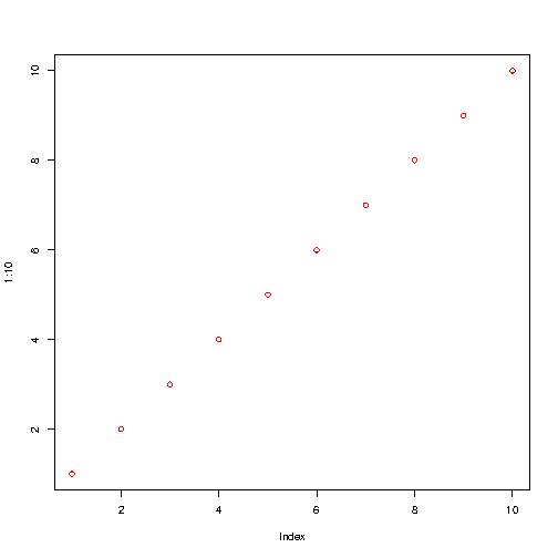
Colors
Use col="color" to add a color to the
points:
Size
Use cex=number to change the size
of the points (1 is default, while 0.5 means 50% smaller, and
2 means 100% larger):
Point Shape
Use pch with a value from 0 to 25 to change the point shape format:
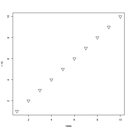
The values of the pch parameter ranges from 0 to 25, which means that we can choose up to 26 different types of
point shapes: