Excel Stacked Bar Charts
Stacked Bar Chart
Stacked bar charts are used to highlights the total amount of contribution for each category.
This is done by stacking the bars at the end of each other.
The charts are used when you have more than one data column.
Example
We want to find out the total number of generation 1 and 2 Pokemons in each of these type 1 categories: "Grass", "Fire", "Water" and "Bug".
You can copy the values to follow along:
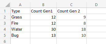
- Select the range
A1:C5
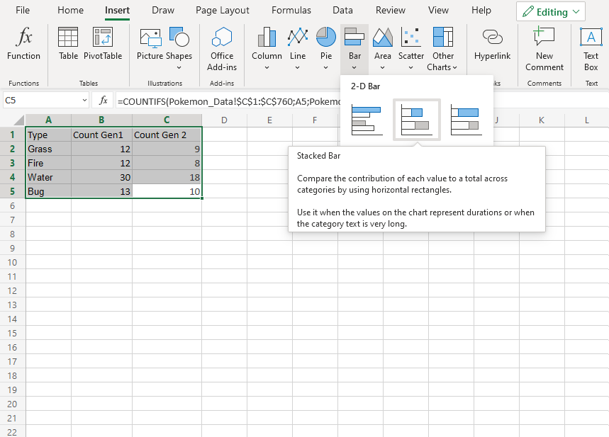
- Click on the insert menu, then click on the bar menu (
 ) and choose Stacked Bar (
 ) from the drop-down menu
Note: This menu is accessed by expanding the ribbon.
Following the steps above, you will get the following chart:

The chart gives a visual overview for the total number of "Grass", "Fire", "Water" and "Bug" type Pokemons in both generation 1 and 2.
Generation 1 Pokemons are shown in blue and generation 2 Pokemons are shown in orange.
This chart shows that "Water" type Pokemons are the most common and "Fire" type Pokemons are the least common.
100% Stacked Bar Chart
100% Stacked Bar is used to highlights the proportion of contribution for each data column in a category.
This is done by scaling the total value of each category in a stacked bar chart to 100.
The charts are used when you have more than one data column.
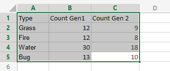
Example
We want to find out the proportion of Pokemon types "Grass", "Fire", "Water" and "Bug" in generation 1 and 2.
You can copy the values to follow along:
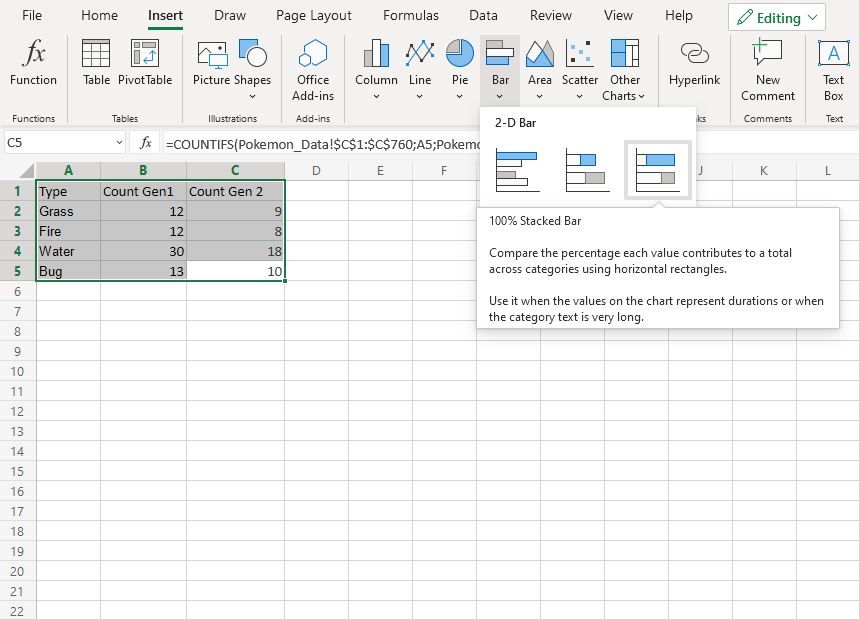
- Select the range
A1:C5
- Click on the insert menu, then click on the bar menu () and choose 100% Stacked Bar (
 ) from the drop-down menu
Note: This menu is accessed by expanding the ribbon.
Following the steps above, you will get the following chart:
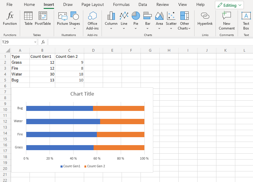
The chart gives a visual overview for the proportion of "Grass", "Fire", "Water" and "Bug" type Pokemons in both generation 1 and 2.
Generation 1 Pokemons are shown in blue and generation 2 Pokemons are shown in orange.
This chart shows that more than half of Pokemons are in generation 1.
