Excel Bar Charts
Bar Charts
Bar charts show the data as horizontal bars.
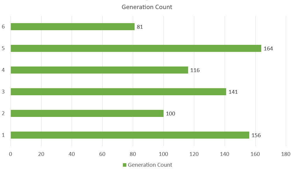
The chart above represents the number of Pokemons in each generation.
Similar to column charts, bar charts are suited for representing values of qualitative (categorical) data.
Note: You can read more qualitative (categorical) data at Statistics Data Types.
There are three different type of bar charts:
- Clustered bar(
 )
) - Stacked bar(
 )
) - 100% stacked bar(
 )
)
Clustered Bar Chart
Clustered Bar charts are used when the value of data is important but the order is not.
Example With One Data Column
We want to find the number of generation 1 Pokemons with types "Grass", "Fire", "Water" and "Bug".
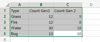
You can copy the values to follow along:
Example
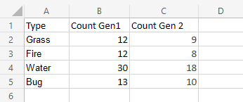
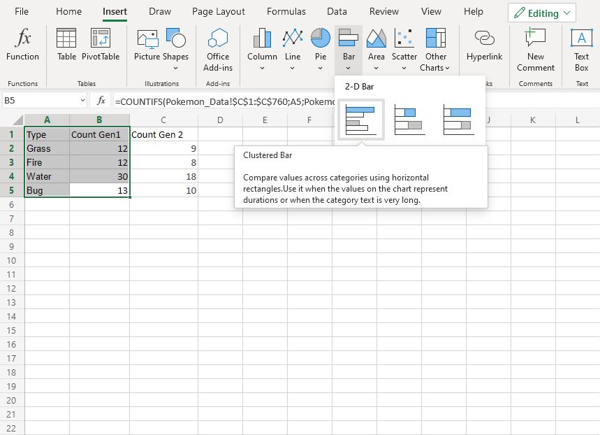
- Select the range
A1:B5
- Click on the insert menu, then click on the bar menu (
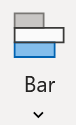 ) and choose Clustered Bar () from the drop-down menu
Note: This menu is accessed by expanding the ribbon.
Well Done! Following the steps above will give you the chart below.
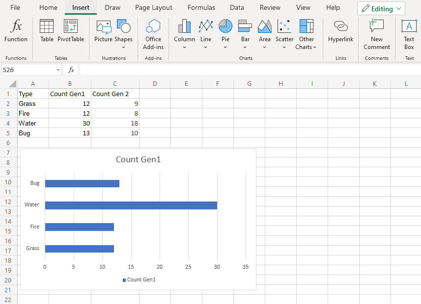
The chart gives a visual overview for the "Grass", "Fire", "Water" and "Bug" type Pokemons in generation 1.
Type "Water" has the most Pokemons in the first generation.
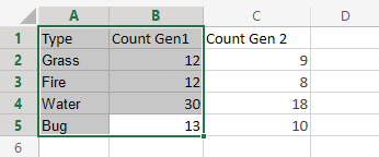
Example With Two Data Columns
Now let's do the same for generation 2 Pokemons and compare the results with the last example.
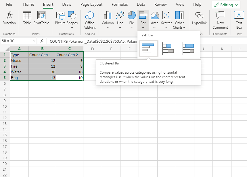
- Select the range
A1:C5
- Click on the insert menu, then click on the bar menu () and choose Clustered Bar () from the drop-down menu
Note: This menu is accessed by expanding the ribbon.
You should get the chart below:
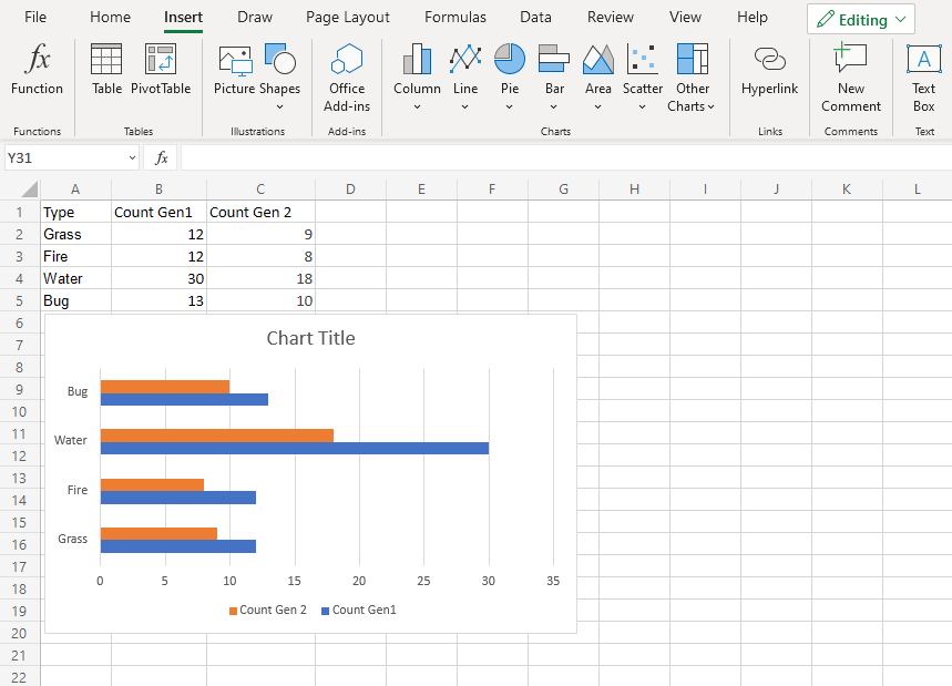
The chart gives a visual overview for the "Grass", "Fire", "Water" and "Bug" type Pokemons in generation 1 and 2.
Generation 1 is shown in blue and generation 2 is shown in orange.
Type "Water" has the most Pokemons in both generations
Also, all the types in generation 2 have less members than generation 1.
