Excel Stacked Line Charts
Stacked Line
Stacked Line charts show the contribution to trends in the data.
This is done by stacking lines on top of each other.
Stacked Line charts are used with data which can be placed in an order, from low to high.
The charts are used when you have more than one data column which all add up to the total trend.
Note: Data which can be placed in an order, from low to high, like numbers and letter grades from A to F are called ordinal data. You can read more about ordinal data at Statistics - Measurement Levels.
Example
Let's see how the average stats add up across Pokemon generations
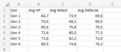
Copy the values to follow along:
Note: This data is rounded to one decimal.
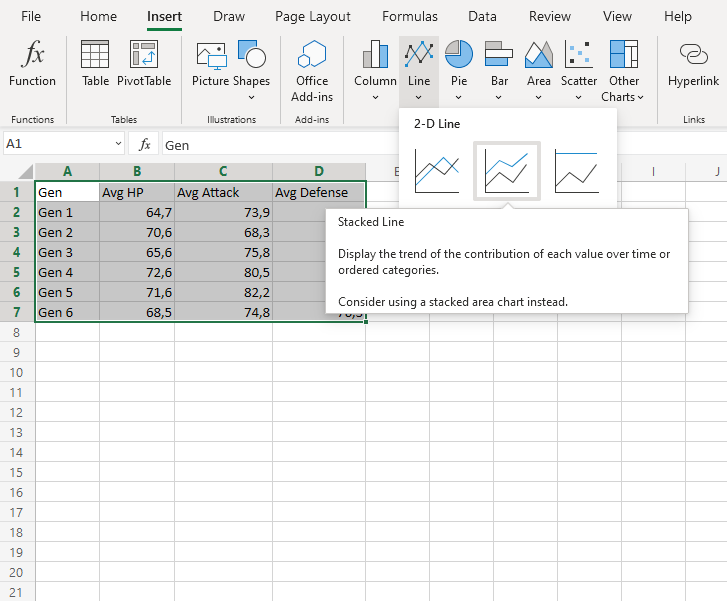
- Select the range
A1:D7for labels and data
Note: This menu is accessed by expanding the ribbon.
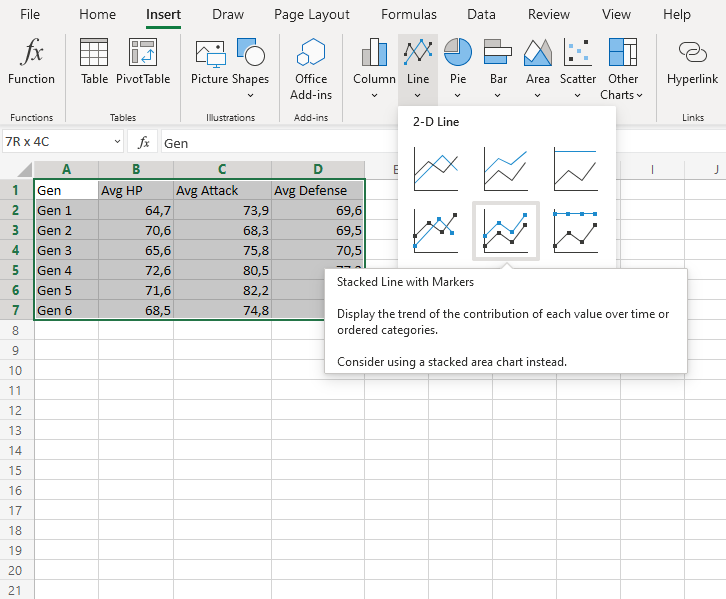
- Click on the Insert menu, then click on the Line menu (
 ) and choose Stacked Line (
 ) from the drop-down menu
You should get the chart below:
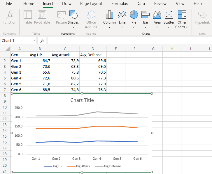
The chart gives a visual overview for the average Pokemon stats over generations.
The blue line shows the average HP, the orange line show the addition of average HP and Average attack. Finally, the gray line shows the sum of all the stats once all the average stats are added.
This chart shows that 4th generation Pokemon have the highest stats on average.
Stacked Line with Markers
Stacked line with markers highlights data points with markers on a stacked line chart.
Example
Let's see how the average stats add up across Pokemon generations
Copy the values to follow along:
Note: This data is rounded to one decimal.
- Select the range
A1:D7for labels and data
Note: This menu is accessed by expanding the ribbon.
- Click on the Insert menu, then click on the Line menu () and choose Stacked Line with Markers (
 ) from the drop-down menu
You should get the chart below:
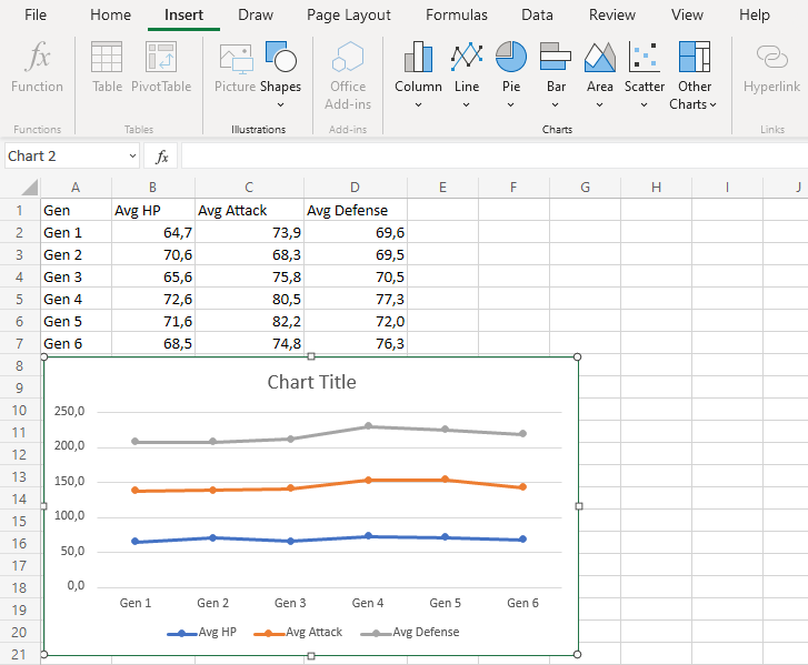
The chart gives a visual overview for the average Pokemon stats over generations.
The blue line shows the average HP, the orange line show the addition of average HP and Average attack. Finally, the gray line shows the sum of all the stats once all the average stats are added.
This chart shows that 4th generation Pokemon have the highest stats on average.
