Excel Radar Charts
Radar Charts
Radar charts show multivariate data as values relative to a center point.
Note: Multivariate data has more than one variables. For example, a dataset containing age and height is multivariate because it has two variables.
Radar charts can only show data that can be ordered from low to high.
Note: Data which can be placed in an order, from low to high, like numbers and letter grades from A to F are called ordinal data. You can read more about ordinal data at Statistics - Measurement Levels.
Radar charts are suited for showing similarities and outliers in the data.
Note: An outlier is a data point that has unusually large/small values compared to the rest of the data.
Excel has three types of radar charts:
- Radar (
 )
) - Radar with markers (
 )
) - Filled radar (
 )
)
Note: Radar chart is also known as web chart, spider chart and star chart.
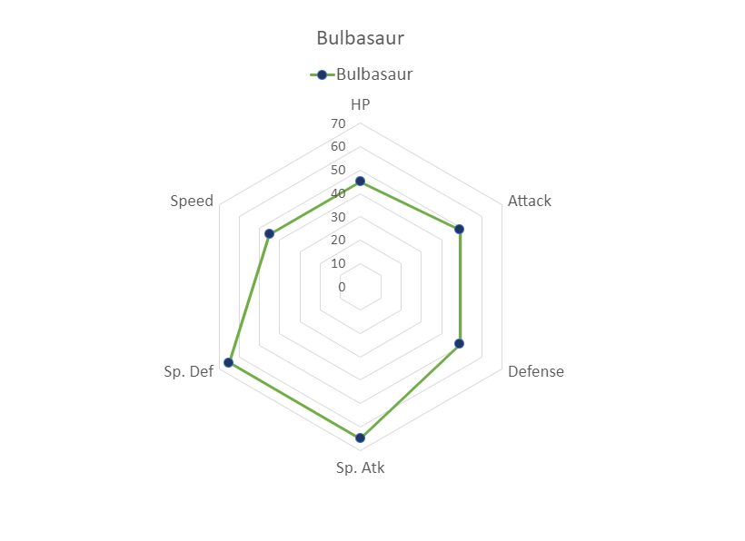
Radar
Radar charts show data as as vertices on a polygon.
The relevant distance from the center of the polygon shows the value of the data point.
Example
Let's compare the stats for Bulbasaur, Charmander and Squirtle.
Copy the values to follow along:
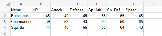
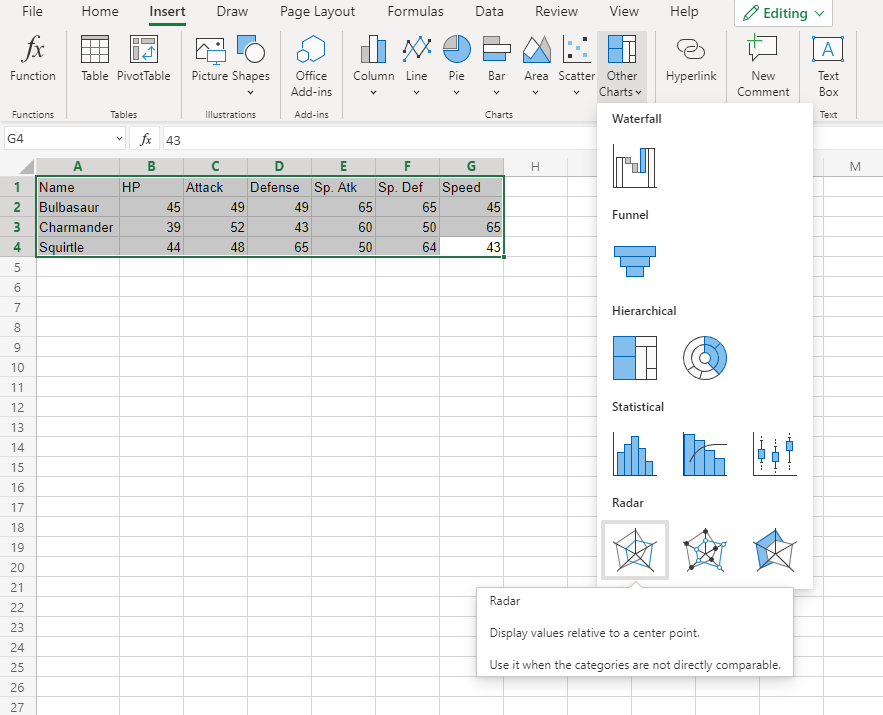
- Select the range
A1:G4
Note: This menu is accessed by expanding the ribbon.
- Click on the Insert menu, then click on the Other Charts menu (
 ) and choose Radar () from the drop-down menu
You should get the chart below:
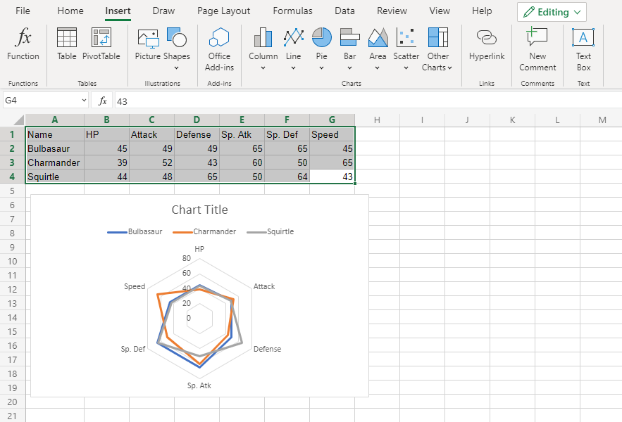
The chart gives a visual overview for the Pokemon stats.
Bulbasaur is shown in blue, Charmander in orange and Squirtle in gray.
The chart shows that Charmander has the highest speed and lowest special defense. Squirtle has the highest defense and lowest special attack. The three Pokemon have similar HP and attack stats.
Radar With Markers
Radar with Markers is similar to radar chart. The only difference is that the data points are highlighted with markers.
Example
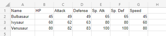
Let's compare the stats for Bulbasaur evolutions to Ivysaur and Venusaur.
Copy the values to follow along:
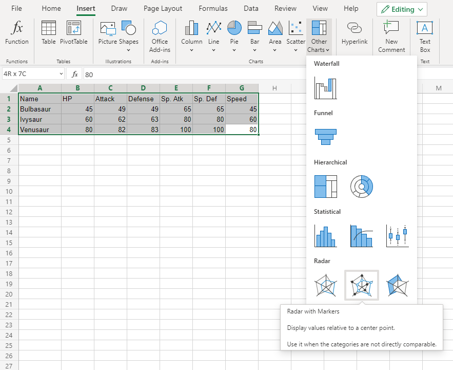
- Select the range
A1:G4
Note: This menu is accessed by expanding the ribbon.
- Click on the Insert menu, then click on the Other Charts menu () and choose Radar with Markers () from the drop-down menu
You should get the chart below:
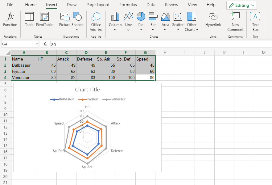
The chart gives a visual overview for the Pokemon stats.
Bulbasaur is shown in blue, Ivysaur in orange and Venusaur in gray.
The chart shows that with each evolution, the stats increase in a similar manner.
Filled Radar
Filled radar is similar to radar chart. The only difference is that inside the charts are filled with color.
Example
Let's compare the stats for Bulbasaur, Charmander and Squirtle.
Copy the values to follow along:
- Select the range
A1:G4
Note: This menu is accessed by expanding the ribbon.
- Click on the Insert menu, then click on the Other Charts menu () and choose Radar () from the drop-down menu
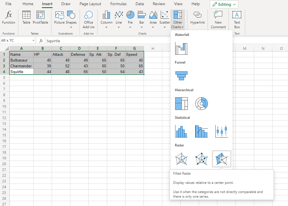
You should get the chart below:
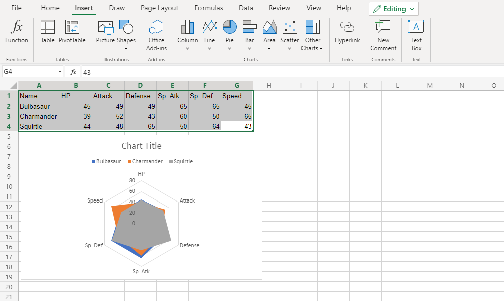
The chart gives a visual overview for the Pokemon stats.
Bulbasaur is shown in blue, Charmander in orange and Squirtle in gray.
The chart shows that Charmander has the highest speed.
Note that since the charts are overshadowing each other, the chart cannot give any more information.
Caution: It's better to avoid using filled radar charts with multiple data columns because some data columns can overshadow others.
Example (The Extreme Case)
Let's compare the stats for Bulbasaur evolutions to Ivysaur and Venusaur.
Copy the values to follow along:
- Select the range
A1:G4
Note: This menu is accessed by expanding the ribbon.
- Click on the Insert menu, then click on the Other Charts menu () and choose Radar with Markers () from the drop-down menu
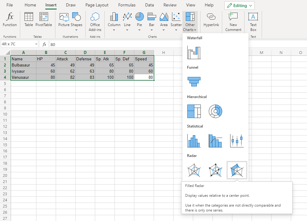
You should get the chart below:
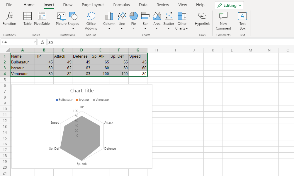
In this chart, Venusaur, which is shown in gray, overshadows all the other Pokemon.
The only information this chart gives is that Venusaur has larger or equal stat values than both Bulbasaur and Ivysaur.
