Excel Chart Customization
Chart Customization
Charts in Excel can be customized.
Customization can be helpful to make the data easier to understand. For example to highlight key points, give additional information and make it look better.
Excel has many options for how to customize a chart. You will learn more about the different options in this chapter.
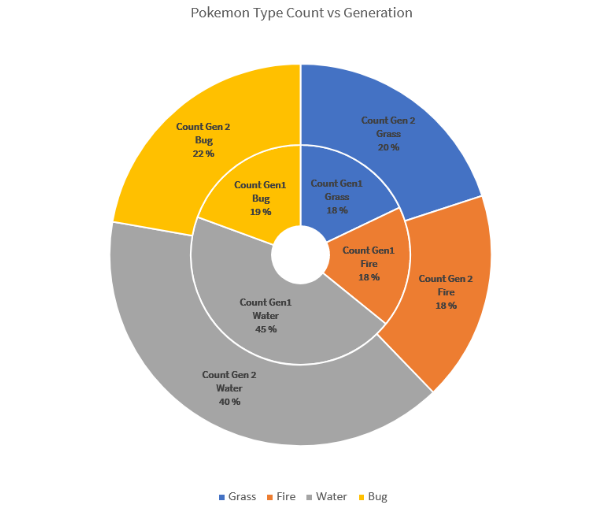
This doughnut chart shows the ratio of different Pokemon types in generations 1 and 2.
The "Water" type, shown in gray has the most Pokemons in both generations. Then there are types "Bug", shown in yellow, "Grass", shown in blue and "Fire", shown in orange.
Note: Different charts can be customized in different ways.
Moving Charts
Excel charts can be moved around the spreadsheet.
How to move a chart, step by step:
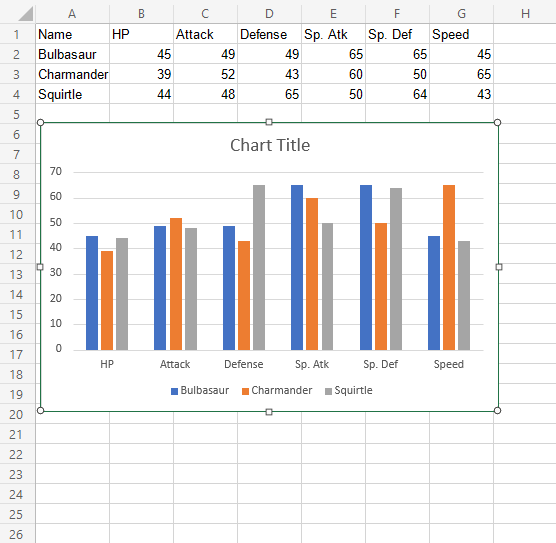
Select the chart by clicking on it.
Note: Selecting a chart highlights its borders.
Drag the chart and place it where you want
Resizing Charts
Excel charts can be resized.
Resizing will scale all the elements in the chart except the text.
How to resize a chart, step by step:
Select the chart by clicking on it.
Click and drag one of the 8 points shown on the chart border and drag them
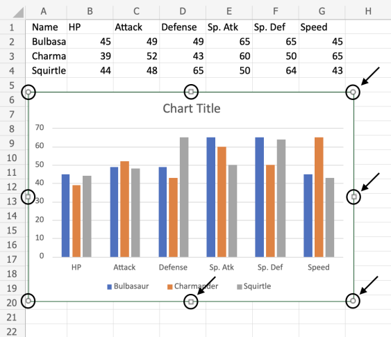
Note: The arrows in the image above are pointing to where you can drag to resize the chart.
The chart is now resized. This can be done as many times as needed to get the right size.
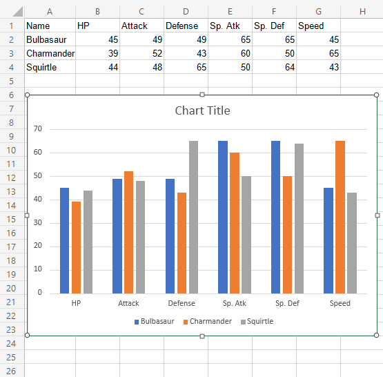
Changing The Chart Title
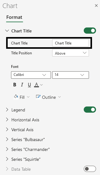
The default chart title in Excel is "Chart Title". This is not informative. The title should describe the chart.
Changing the title, step by step:
Double click on the chart
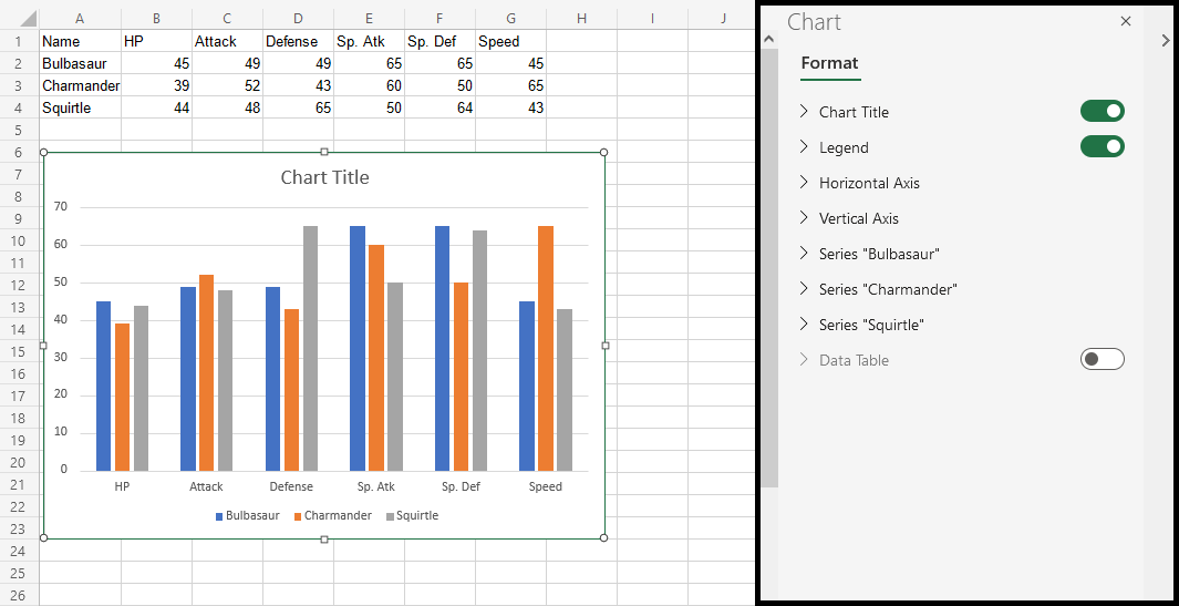
This opens up a menu on the right side of your screen.
Find "Chart Title" text in the newly opened menu and change it
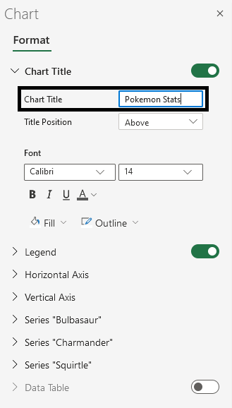
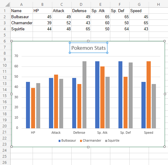
Now, the title has changed to "Pokemon Stats".
Note: You can remove the chart title by clicking on it and pressing the Deletekey on your keyboard.
Customization Options
Charts can be customized in different ways, here are some elements you can change:
- Legends
- Axis
- Data labels
- Grid lines
- Styling and formatting
