Excel Charts
Excel Charts
Charts are visual representations of data used to make it more understandable.
Commonly used charts are:
- Pie chart
- Column chart
- Line chart
Different charts are used for different types of data.
Note: Charts are also called graphs and visualizations.

The chart above is a column chart representing the number of Pokemons in each generation.
Note: In some cases the data has to be processed before plotted into a chart.
Charts can easily be created in a few steps in Excel.
Creating a Chart in Excel
Creating a chart, step by step:
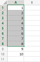
Select the range
A1:A8
Example
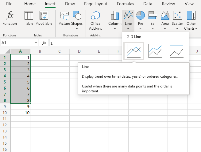
Click on the Insert menu, then click on the Line menu (
 ) and choose Line (
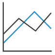 ) from the drop-down menu
Note: This menu is accessed by expanding the ribbon.
You should now get this chart:
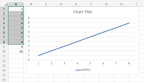
Excellent! You have now created your first chart.
Note: The cells 9 and 10 were not selected in the range, and therefore not included in the graph.
Creating Another Chart in Excel
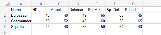
Lets compare the stats for the Pokemons; Charmander, Squirtle and Bulbasaur using a column chart.
- Select the range
A1:G4
Example
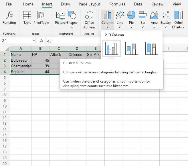
- Click on the insert menu, then click on the column menu (
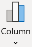 ) and choose Clustered Column (
 ) from the drop-down menu
Note: This menu is accessed by expanding the ribbon.
You should now get this chart:
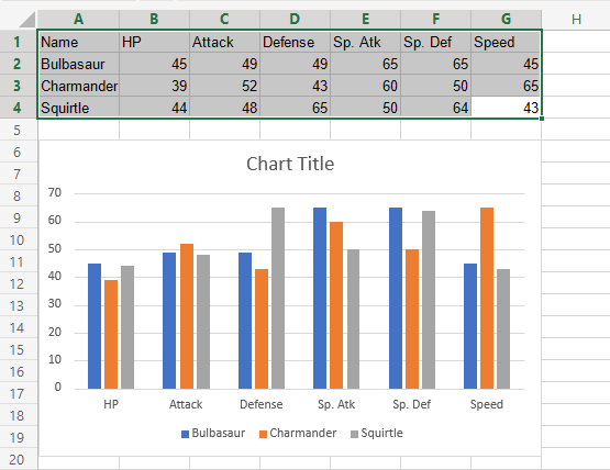
The chart gives a visual overview for the Pokemons stats.
Charmander, represented by the orange bars, and has the highest speed. Squirtle, represented by the gray bars, has the highest defense.
Note: The default chart title is "Chart Title". It can be changed. You will learn about chart customization in a later chapter.
