
Excel PivotChart
PivotChart
A PivotChart is a chart that is connected to a PivotTable.
When you change the PivotTable, the chart changes with it.
This chapter uses Poke Mart sales data. Download it to follow along: poke_mart_sales.xlsx
Prepare the PivotTable
Let's chart the sales of each region, year by year. Build this PivotTable first:
- Drag Region to the Rows area
- Drag Date to the Columns area, and group it by Years only (see PivotTable Group)
- Drag Sales to the Values area, and format it with a thousands separator (see PivotTable Values)
| A | B | C | D | |
|---|---|---|---|---|
| 3 | Sum of Sales | Column Labels | ||
| 4 | Row Labels | 2024 | 2025 | Grand Total |
| 5 | Hoenn | 1,324,700 | 1,647,300 | 2,972,000 |
| 6 | Johto | 1,612,450 | 1,751,200 | 3,363,650 |
| 7 | Kanto | 1,456,050 | 1,625,100 | 3,081,150 |
| 8 | Grand Total | 4,393,200 | 5,023,600 | 9,416,800 |
Insert a PivotChart
- Click any cell in the PivotTable
- Click PivotTable Analyze > PivotChart
- The Insert Chart dialog opens. Choose Column > Clustered Column
- Click OK
The fields in Rows become the categories along the bottom of the chart: Hoenn, Johto and Kanto.
The fields in Columns become the legend: 2024 and 2025. Each region gets one column for each year.
The chart shows that every region sold more in 2025 than in 2024. Johto is the biggest region in both years, and Hoenn passed Kanto in 2025.
The Grand Total is not shown in the chart.
You can also start from the data: Insert > PivotChart creates a new PivotTable and a PivotChart together.
The Chart Follows the PivotTable
A PivotChart always shows the same data as its PivotTable. Filters, slicers and field changes work on both.
Try it with a slicer:
- Click any cell in the PivotTable
- Click PivotTable Analyze > Insert Slicer, check Category, and click OK
- Click Balls in the slicer
The PivotTable and the chart now both show ball sales only.
It also works the other way round. When a PivotChart is selected, the pane is called PivotChart Fields, and changes you make there also change the PivotTable.
Read more about slicers in PivotTable Filter and Slicers.
Field Buttons
A PivotChart shows gray field buttons on the chart: one for the value (Sum of Sales), one for the legend field and one for the category field (Region).
They work like the filter arrows in the PivotTable. For example, click the Region button to show only some regions.
The buttons are useful while you work, but they clutter a finished chart. To hide them:
- Click the chart
- Click PivotChart Analyze > Field Buttons > Hide All
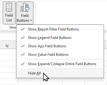
You can also right-click a field button and choose Hide All Field Buttons on Chart.
The filters still work. Use the PivotTable or a slicer to change them.
Format a PivotChart
Most chart tools work on a PivotChart too: chart styles, titles, colors and data labels.
Read more in Excel Charts, Excel Column Charts and Excel Chart Customization.
A PivotChart cannot be a scatter (XY), bubble or stock chart.